Transport and construction, infrastructure projects
Redesign of the mark and the visual identity
The task
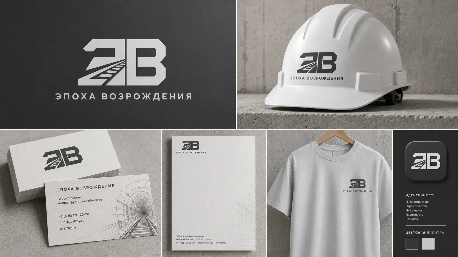
The company needed a visual identity that matched its priorities and the scale of its work: a mark and a system of carriers that hold up equally in digital channels and in production — from documents to workwear and merchandise.
What we built
The identity was reworked from what the company does and what it puts at the centre of its work. The mark is a two-letter monogram with a receding route motif, built on a single stroke weight and legible in one colour. The carriers and the rules for setting them were built around it. The work was done by the studio's designers.
What the work included
-
The mark
the monogram and its construction, a version with the name line, a monochrome rendering and behaviour at small sizes
-
Carriers
business cards, letterhead, helmets and workwear, merchandise, the app icon
-
Rules of use
a two-tone palette, rules for placement on digital and physical carriers, an industry illustration set